If you ask me, blobs are one the most beautiful-looking things that one can create using CSS. The animated ones, even more so.
But me being someone who sucks at creating beautiful design elements, thinking about making something like a blob seemed pretty scary to me in the beginning. Turns out, beyond the fear, things are pretty simple. It is fairly simple to create nice-looking blobs using plain CSS and without the need for any CSS libraries like TailwindCSS.
Let’s dive in and see how can we create CSS Blobs.
Create CSS Blobs
We will create a simple a create a couple of varieties of a CSS blob, along with a simple CSS blog. They will look as below:

To create something like the above, create an HTML file and create a couple of divs in it as done in the code below:
<body>
...
<h1>CSS Blob & Animated Blob Examples</h1>
    <div class="container">
        <div class="blob">
        </div>

    </div>
...
</body>
This will be the base of the design, which we will style.
Now to tun this invisible div, add the following CSS to the <style> section of your HTML file. Or, link it to an external CSS file. I do the latter, in my example.
.container .blob{
    border-radius: 94% 31% 30% 67% / 67% 37% 56% 34%;
    width: 250px;
    height: 250px;
    background: #f09;
    background-image: linear-gradient(45deg, #3023AE 0%, #f09 100%);
    box-shadow: -10vmin 10vmin 0 rgba(255,255,255,0.07);
}
And that’s it!
That’s all you need to create a CSS blob as shown above. Feel free to play with the CSS values and see how they reflect on the HTML page.
How To Animate CSS Blobs?
While it might sound a complex thing to do, it only takes a few additional lines of code to animate your CSS blob. Update the following CSS code in your file and reload the HTML page and you should see the animation in action!
border-radius: 40% 60% 60% 40% / 70% 30% 70% 30%;
    width: 250px;
    height: 250px;
    background: rgb(0, 255, 98);
    background-image: linear-gradient(45deg, #3023AE 0%, rgb(0, 255, 98) 100%);
    box-shadow: -10vmin 10vmin 0 rgba(255,255,255,0.07);

	animation: animateBlob 10s linear infinite alternate;
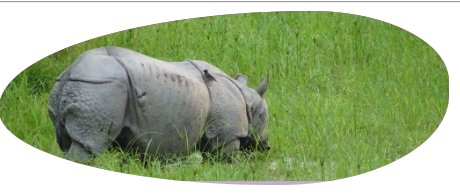
[BONUS] How To Add an Image Background To a CSS Blob?
While playing around with the look & feel of the CSS blob, I also tried adding a background image to an animated blob, just to see how it looks. I liked what I was able to come – up with so sharing the same. Maybe you will find some real use case to use it. If you do, I would be interesting to see it. So, do share.

The code of the CSS Blob with an image background is given below:
border-radius: 23% 31% 30% 67% / 72% 47% 40% 26%;
    width: 450px;
    height: auto;
    background: linear-gradient(#a03692, #b46ca8, #c0aec5);
    overflow: hidden;
    animation: animateImg 8s linear infinite;
You can also download the example project from here. It has all the 3 examples I have talked about here.


